

John W. Figueroa is a product experience designer based in Montgomery, Texas, near The Woodlands and Houston, who works with clients nationwide. He helps businesses turn complicated services into apps, websites and booking flows people can actually use. For OneBody, a whole-person health app backed by a major healcare organization, he designed the mobile experience from paper sketches to a fully linked prototype and brand system, and the work helped win executive product funding approval.
What is product experience design?
Product experience design is planning and designing every step a customer takes with your product, from the first question they're asked to the moment they book, buy or come back. It covers the user experience (UX), the screens (UI), the brand look and the rules that keep it consistent. The goal is simple: fewer people get confused or quit, and more people finish what they came to do.
What problem did OneBody need to solve?
OneBody needed one app that could treat weight and mental health together and keep patients connected to their own doctors. The two conditions often go hand in hand, but most digital health apps treat only one. Patients face apps that make big promises with little clinical support, and doctors have few digital programs they trust enough to recommend.
OneBody started with a referral from a primary care provider. It paired a digital program (lessons, tracking, coaching, community) with a clinical program (therapists, nurse practitioners, prescriptions). My job was to make that feel personal and calm for someone who may be struggling, and to connect them to a real clinician at the right moment.
What principles guided the design?
I owned the mobile UX and UI, the clickable prototype, the style guide and the motion graphics, working with the OneBody team and clinical advisors. Three principles shaped every screen:
-
Ask how people feel before asking for data. Every flow opens with a human question and gets clinical only when it needs to.
- One app, two programs. Weight and mental well-being share one home screen, one activity log and one care team.
- Keep a real person close. A coach, a peer group, a therapist or a nurse practitioner is always one tap away.
How does the design process work, from idea to prototype?
I go from paper sketches to a clickable prototype that people can tap through before anyone writes code. That lets a team test the idea, spot problems and win approval while changes are still cheap. For OneBody it ran in four steps:
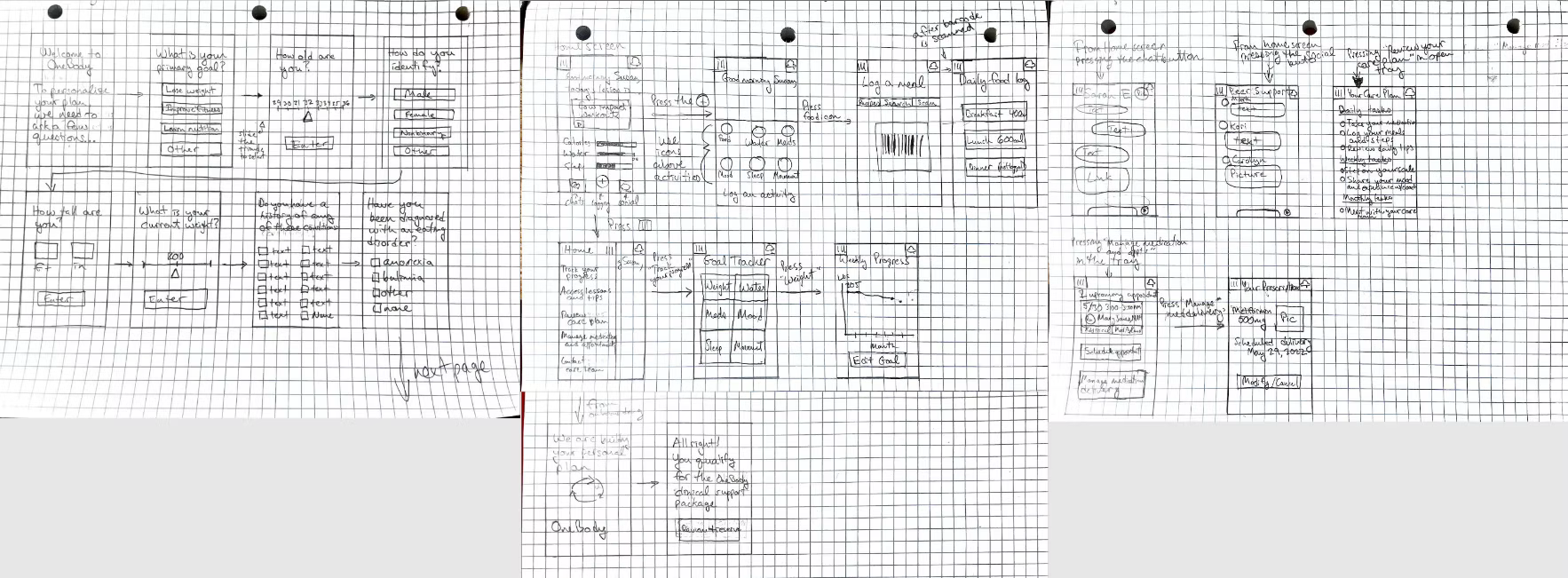
- Map the journey on paper. I sketched the full patient path on grid paper: intake questions, a home screen with daily goals, meal logging with a barcode scanner, goal tracking and weekly progress, coach and peer chat, a care plan, appointments and prescription delivery.
- Design for safety early. Intake screens for eating disorder history before anyone is placed in a weight program. That decision shaped who qualifies for clinical support.
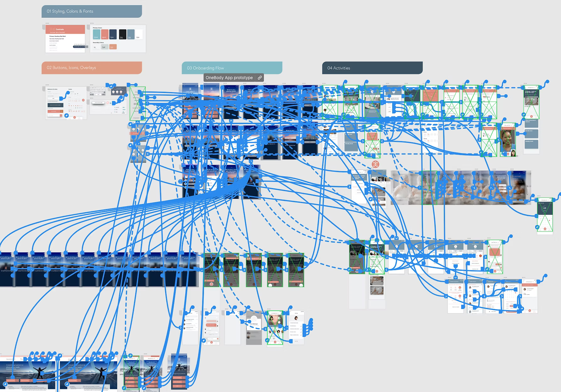
- Build the system first. I organized the prototype like a design system: styles, colors and fonts, then buttons, icons and overlays, so every screen reused the same parts.
- Link every screen. The final prototype connected the onboarding flow and every activity, so leadership and clinical advisors could tap through real scenarios instead of reading a spec.
Which design decisions made the app easier to use?
Four decisions did the most work: a feelings-first intake, a home screen that coaches, support that scales with mood, and a real person always nearby. Each one carries a lesson any business can use.
1. Intake that starts with feelings
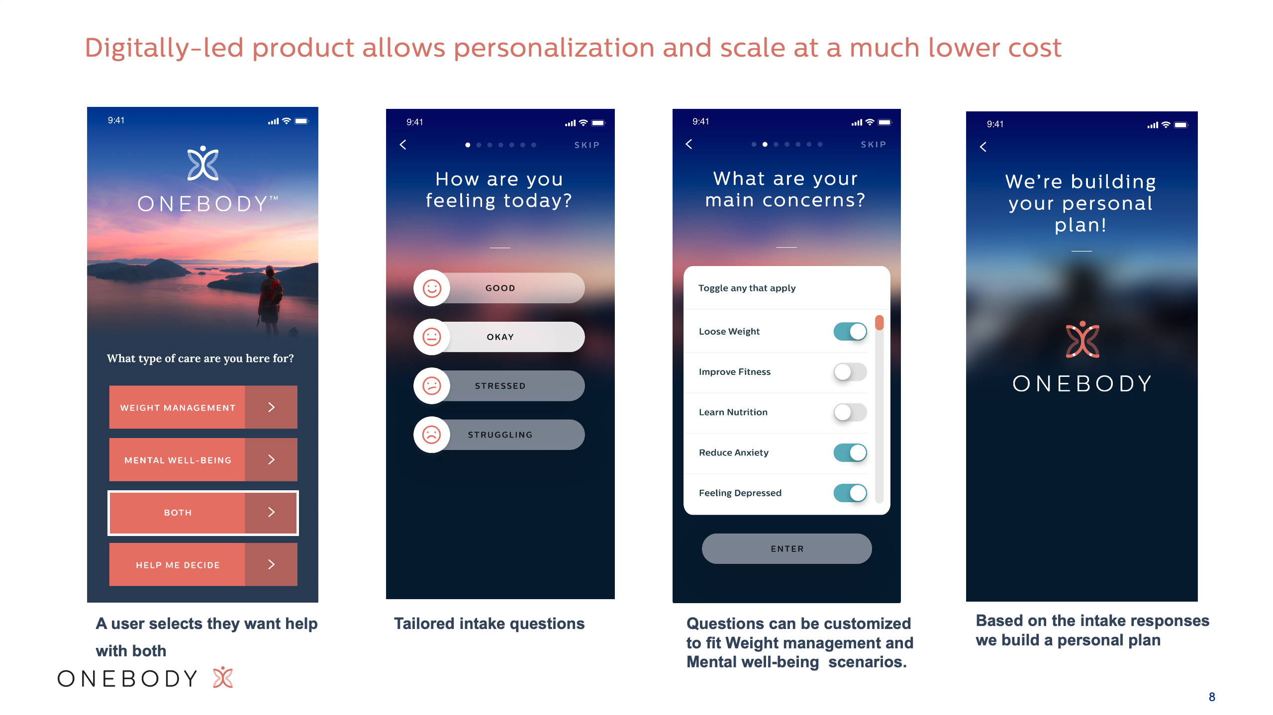
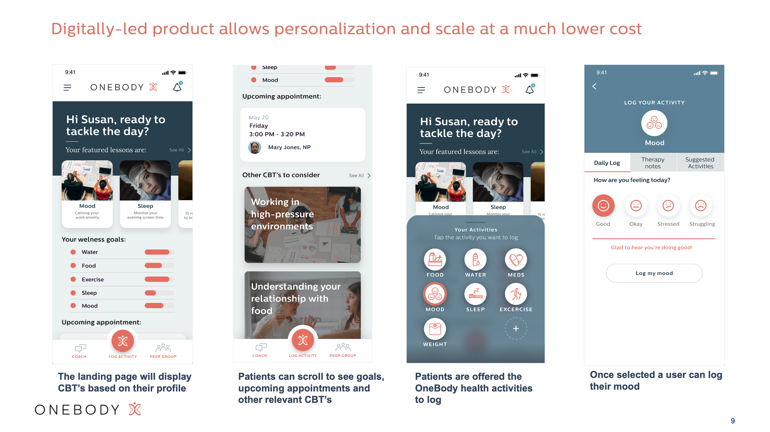
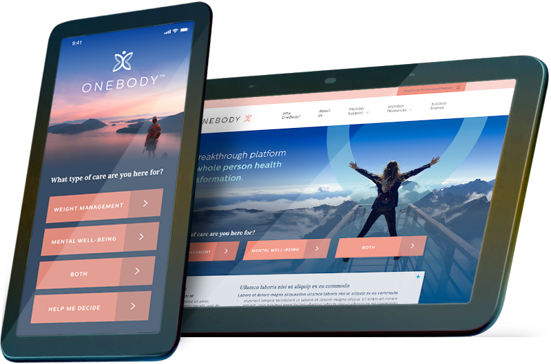
The first question is "What type of care are you here for?" with four answers: weight management, mental well-being, both, or help me decide. "Both" and "Help me decide" matter most. They tell people with overlapping needs that they're in the right place, and they give the undecided a way in instead of a dead end. The next screen asks "How are you feeling today?" Then a short set of toggles captures main concerns, and the app builds a personal plan from the answers.
Lesson for any business: your first question decides who stays. Give undecided customers a "help me decide" path instead of a dead end.
2. A home screen that coaches, not nags
Home greets the patient by name and leads with featured lessons chosen from their profile, based on cognitive behavioral therapy (CBT). Below that are simple progress bars for water, food, exercise, sleep and mood, the next appointment with their nurse practitioner, and more lessons to explore. One central Log activity button opens food, water, meds, mood, sleep, exercise and weight, so every habit is logged the same way.
Lesson for any business: one clear main button beats a menu of options. Make the action you want most the easiest one to take.
3. Support that scales with mood
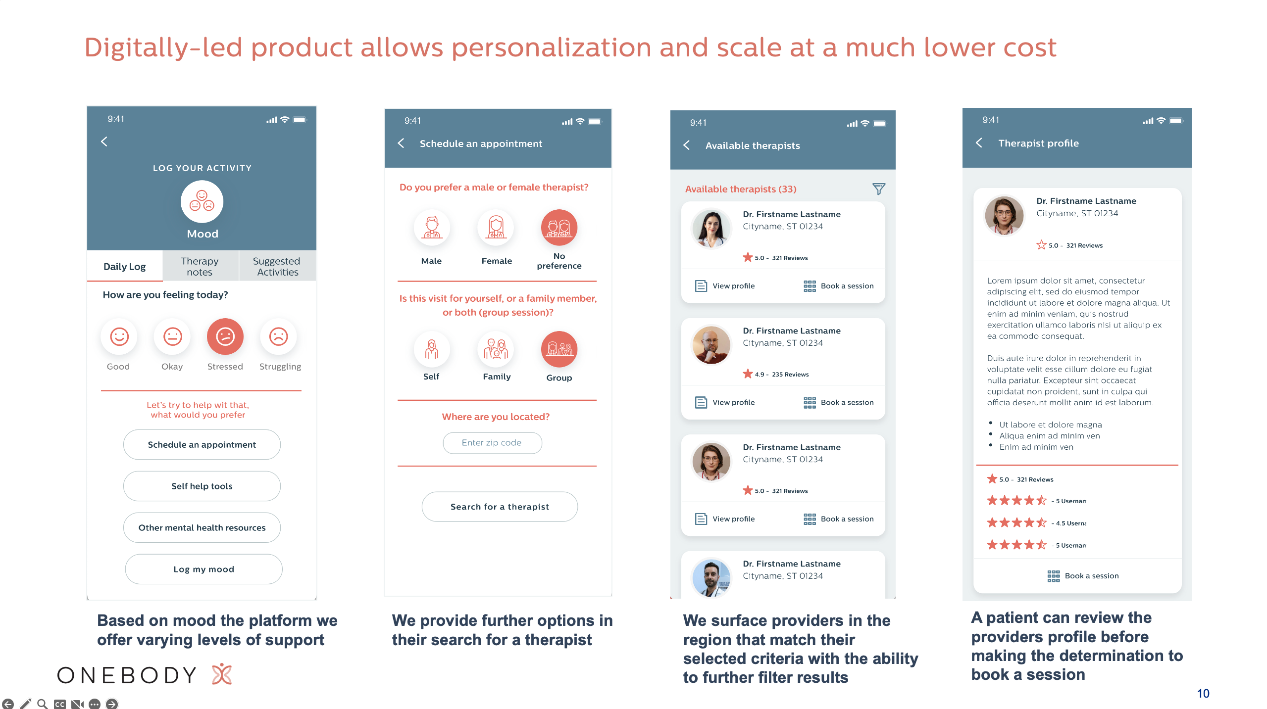
When a patient logs "Good," the app simply celebrates. When they log "Stressed" or "Struggling," it offers more help: schedule an appointment, self-help tools or other mental health resources. Booking asks what matters to them (therapist gender, self, family or group session, location), surfaces matching therapists in their region with ratings and filters, and lets them review a full profile before they book.
Lesson for any business: match the help to the moment. A happy customer needs a thank-you; a frustrated one needs a fast path to a person
4. Never alone: community, coaching, devices and clinical visits
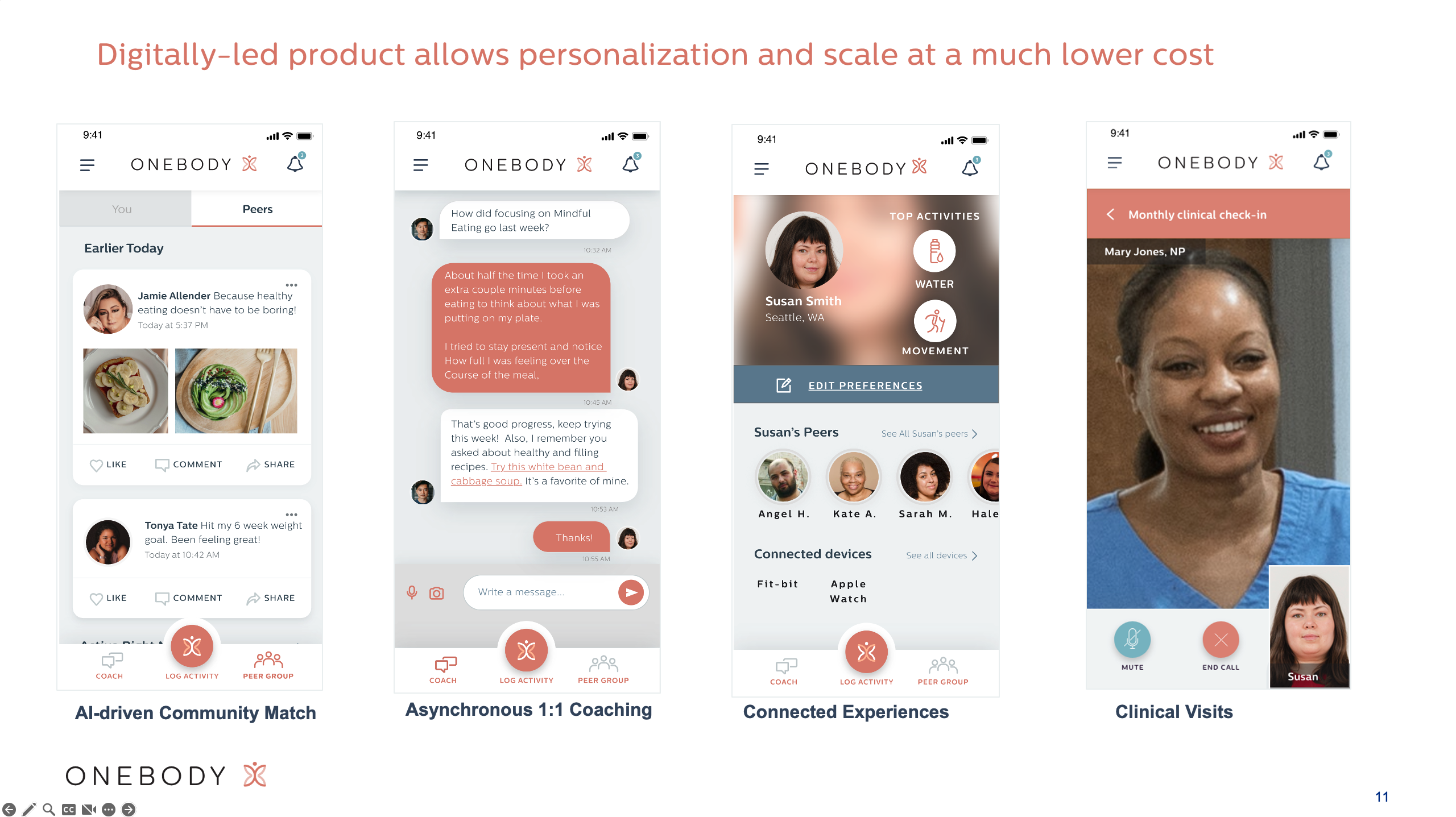
Four features keep people engaged between visits. AI-driven community match connects patients with peers on similar goals. Asynchronous 1:1 coaching lets a coach follow up on last week's goal and share a recipe. Connected devices pull in Fitbit and Apple Watch data. Clinical visits bring the nurse practitioner into a monthly video check-in.
Lesson for any business: people come back to products that connect them to people. Build in follow-ups, community or a human check-in.
How does a design system keep a brand consistent?
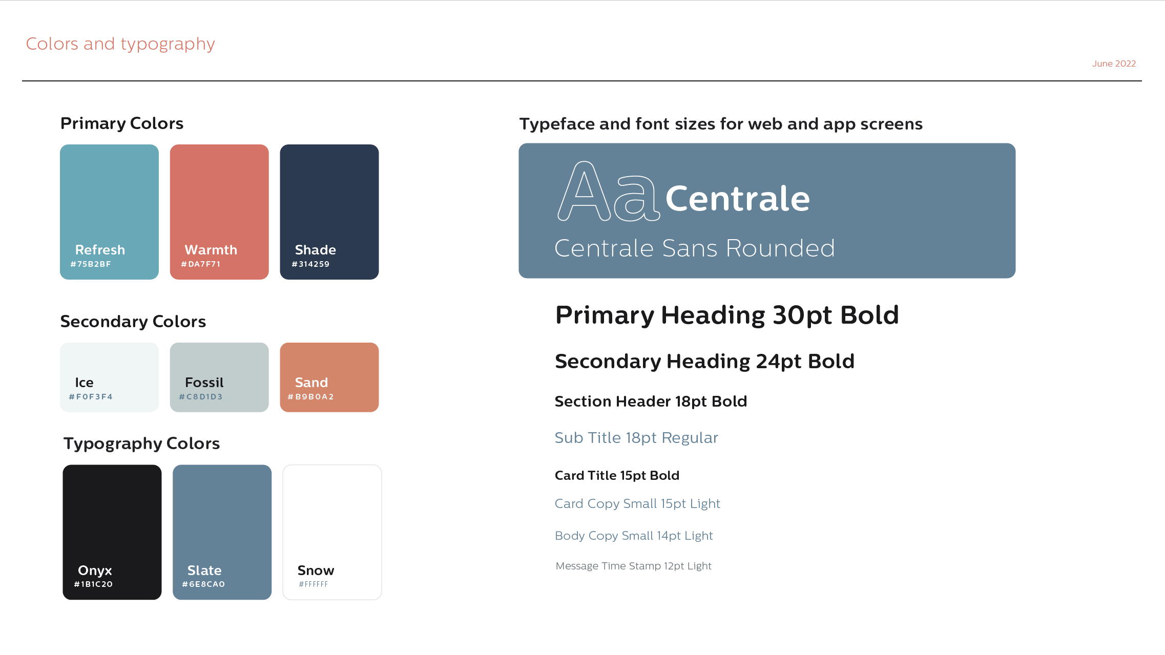
A design system is a shared set of colors, type, logos and reusable parts, so every screen, page and ad looks like it came from the same company. It also makes new screens faster and cheaper to build.
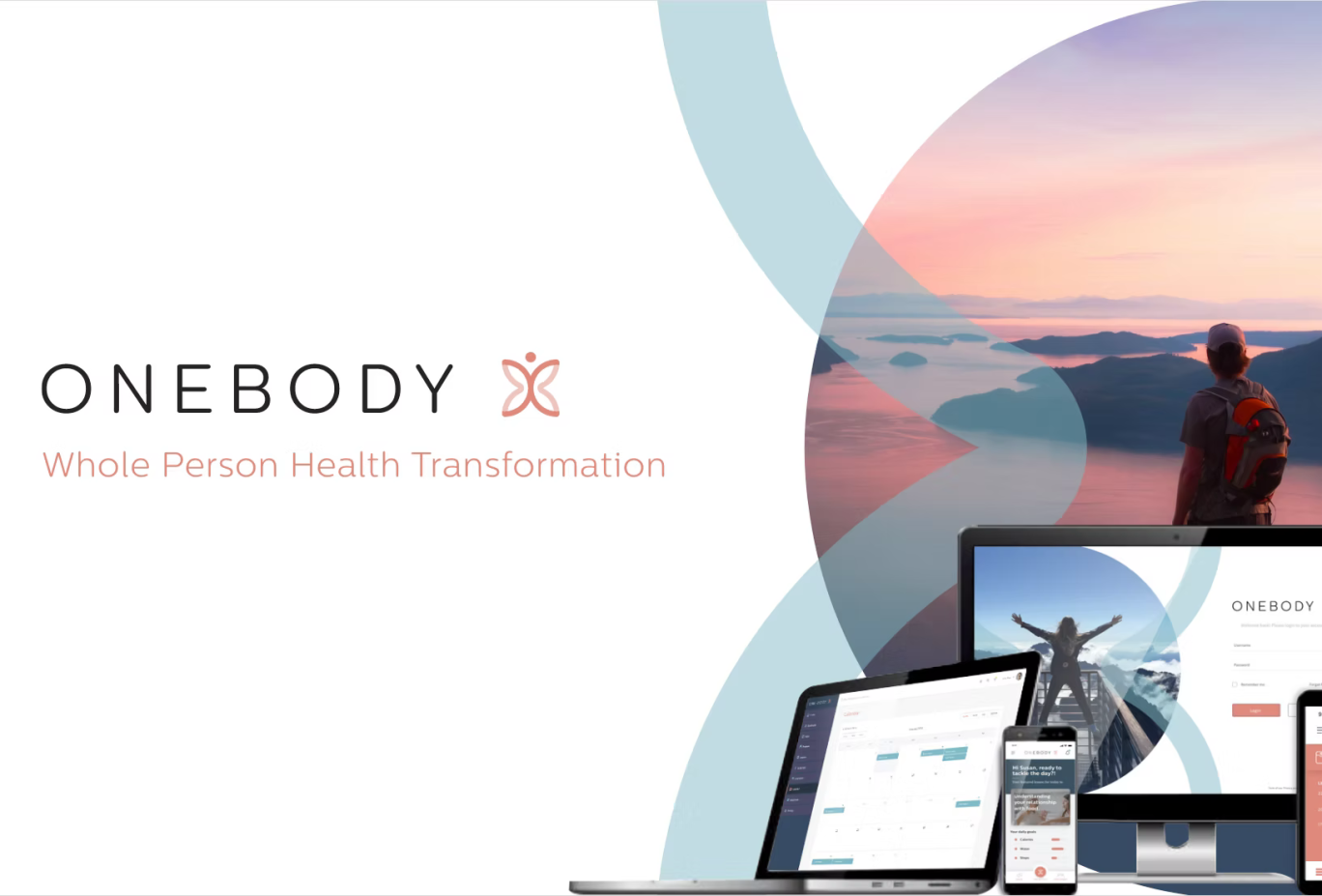
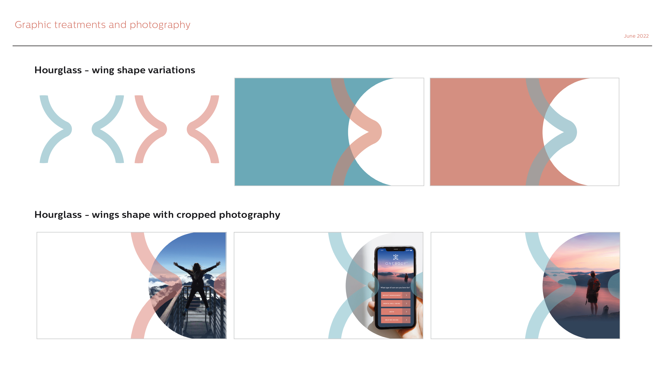
The visual language had to feel warm and hopeful without looking like a diet ad or a clinic. The mark is a butterfly that is also a person with arms raised, set in vertical and horizontal lockups for light and dark backgrounds, with clear-space rules built in.
The hourglass wing shape, taken from the logo's wings, frames photography of people outdoors at sunrise and on summits. It ties the app, the website and the pitch materials together at a glance.

CONTACT US
We'd love to hear from you, let us know how we can help and we'll get right back to you!
| Name * | |
|---|---|
| E-mail * | |
| Message * | |

I am the vine; you are the branches. Whoever abides in me and I in him, he it is that bears much fruit, for appart from me you can do nothing.
JOHN 15:5